What is SAC?
SAP Analytics Cloud (SAC) Analytics Designer empowers users to craft custom analytical applications and dashboards tailored to their specific business needs. This innovative tool brings together data connectivity, visualization, and application development capabilities in a single, integrated environment. SAC is also an IBCS certified provider. This blog includes a custom solution in SAC analytics designer for dynamically aligning the axis lines of several charts based on the data to make your report IBCS proof.
Aligning the axis and IBCS
If you want to compare different graphs in one glance we need to structure the data. With structuring the data we can help users to recognize the patterns and outliers of the data. One of things you can do to create a proper structure is aligning the axis of the graphs.
Within IBCS the small multiples are a great example where aligning the axis is needed. Small multiples are small graphs for several elements of a structure dimension. This chart type makes is possible for end users to compare the data of different dimensions with each other. For example the gross profit split per country.
What do we want to solve:
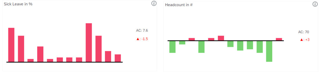
From this:
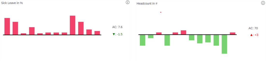
To this:
The solution
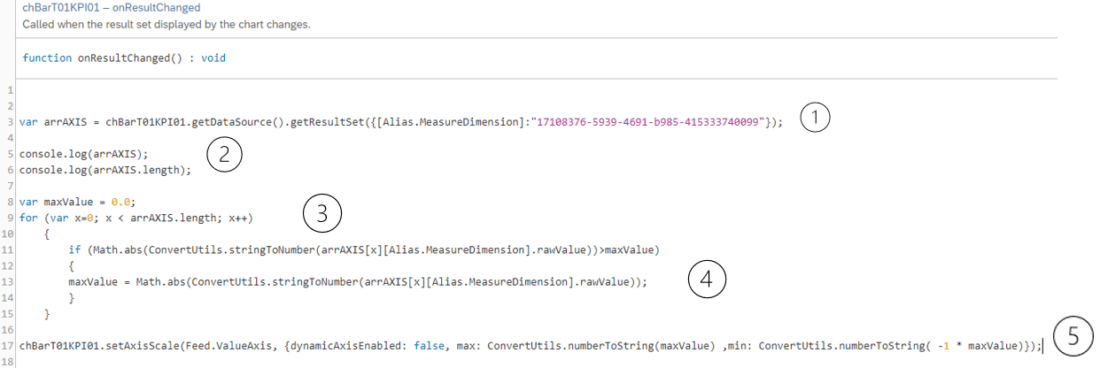
Here is the way and the code of the alignment:
- Use an array to retrieve the whole related KPI data from the source table into an array.
- You can check the content and length of the array by using “console.log();“
- Then loop this array and get the measure values.
- Check if the absolute measure value is the max value in the data and assign it to maxValue variable.
- Set Axis Scale of the chart as max: maxValue and min: (-1 * maxValue)

BI Consultant
Esra Guclu Arici
Do you want more information?
Contact us and talk to one of our experts.